Detailed Tool Tips index
This section is hidden from help center menus, but it's paragraphs are linked direktlely to the tool tip marking in the administration.
-
1.
Screens
-
1.1
Timing and Sequence
Awaiting Translation
-
1.1.1
Article and image duration
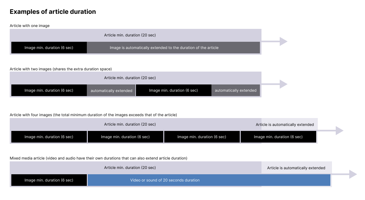
Set the minimum duration of articles and their images.
These durations may automatically be extended under some circumstances:- Image durations are extended if the sum of their duration is shorter than their article's duration.
- Article durations are extended if the sum of their media lasts longer than the article itself.
-
1.1.1
-
1.2
Primary logo
On uniFi+activs the primary logo is shown in the bottom right of main menu.
On uniFi+display and +idles the primary logo is shown in the top left of the screen.
-
1.2.1
Adjust primary logo margins
Use the margin setting to create air around your logo if needed.
- For +activs, The primary logo snaps to the bottom right corner of the main menu.
Therefore it's the right and bottom margin field that has an impact on this logo. - For +display / +idles, it's the top and left margins that changes the logo's position.
The unit is in pixels.
- For +activs, The primary logo snaps to the bottom right corner of the main menu.
-
1.2.1
-
1.3
Secondary logo
On uniFi+activs the secondary logo is shown in the preloader which appears in the transitions between main menu and presentations.
On uniFi+display and +idles the secondary logo is shown in the top right of the screen.
-
1.4
Device
In this tab, you're able to connect your screen with the device which shows your uniFi+ screen.
To pair your screen with your device, simply input the displayed ID on your screen and click the Pair button.
To pair your screen with another device, click on the Unpair button and pair the screen again as described above. -
1.5
Styling
This setting gives you the ability to choose what your screen should look like by choosing a Style Theme for the screen.
To start creating your own Style Theme, click on the Style Themes settings bar in the settings menu:
Read more about designing your own Style Theme for a detailed guide on the Styles Themes capabilities.
-
1.6
Specific Settings for uniFi activ
Awaiting Translation
-
1.6.1
Show article media as squares
You can choose to show article media (thumbnails and current image/video) as cropped to squares. This affects only the presentation of the media. The files are not cropped.

Note 1: In fullscreen-view media are always shown in its original aspect ratio without cropping
Note 2: uniFi+activ in portrait view will always show square article media, if the article contains more than one media item. This is to avoid the text box from vertical jumping when changing images.
Note 3: Book covers in articles from Bookshelfs or from the Search widget are never cropped.
-
1.6.1
-
1.1
-
2.
Articles
-
2.1
Content
Awaiting Translation
-
2.1.1
The title of the article
The title is mandatory for creating the article. Keep it short but also describing for the content you want to communicate.
-
2.1.2
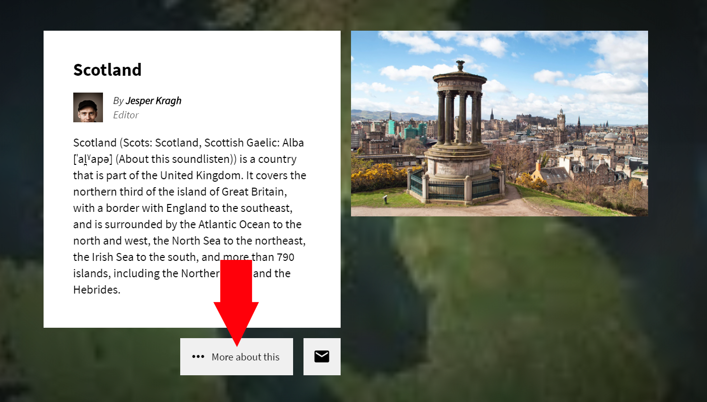
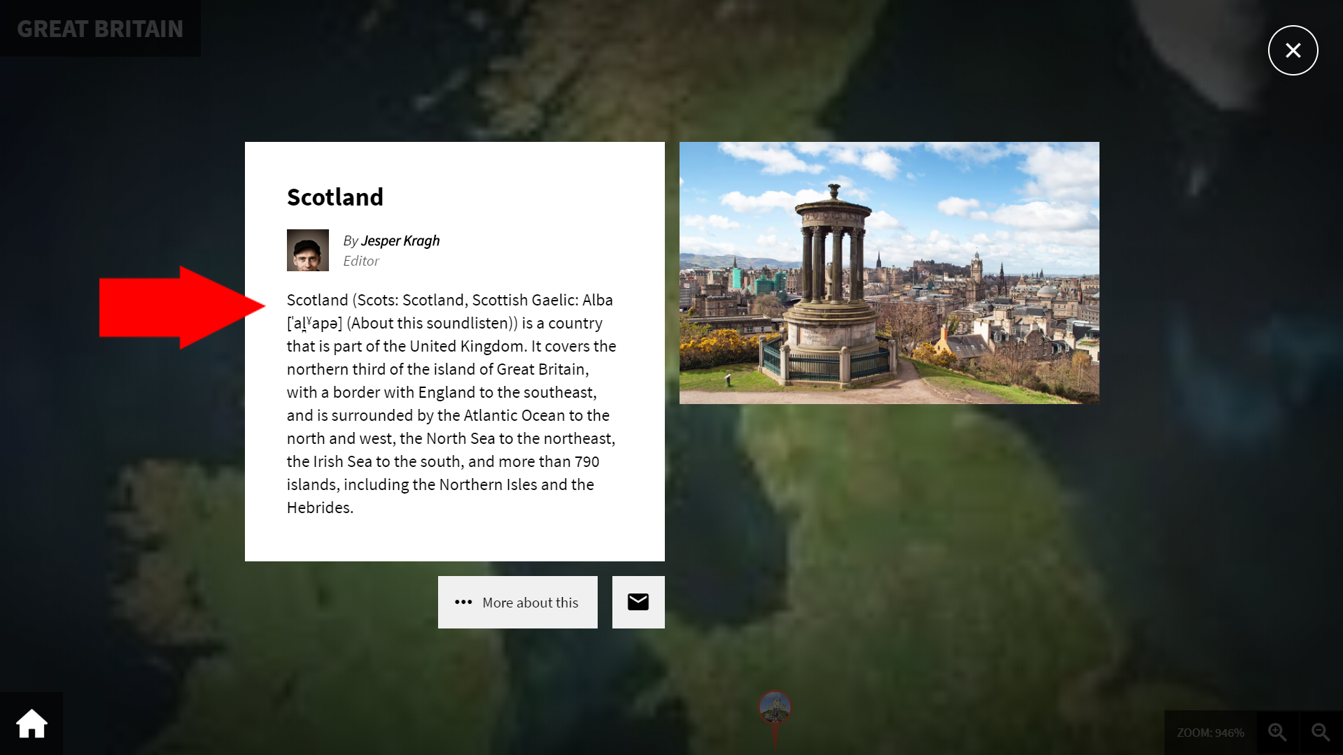
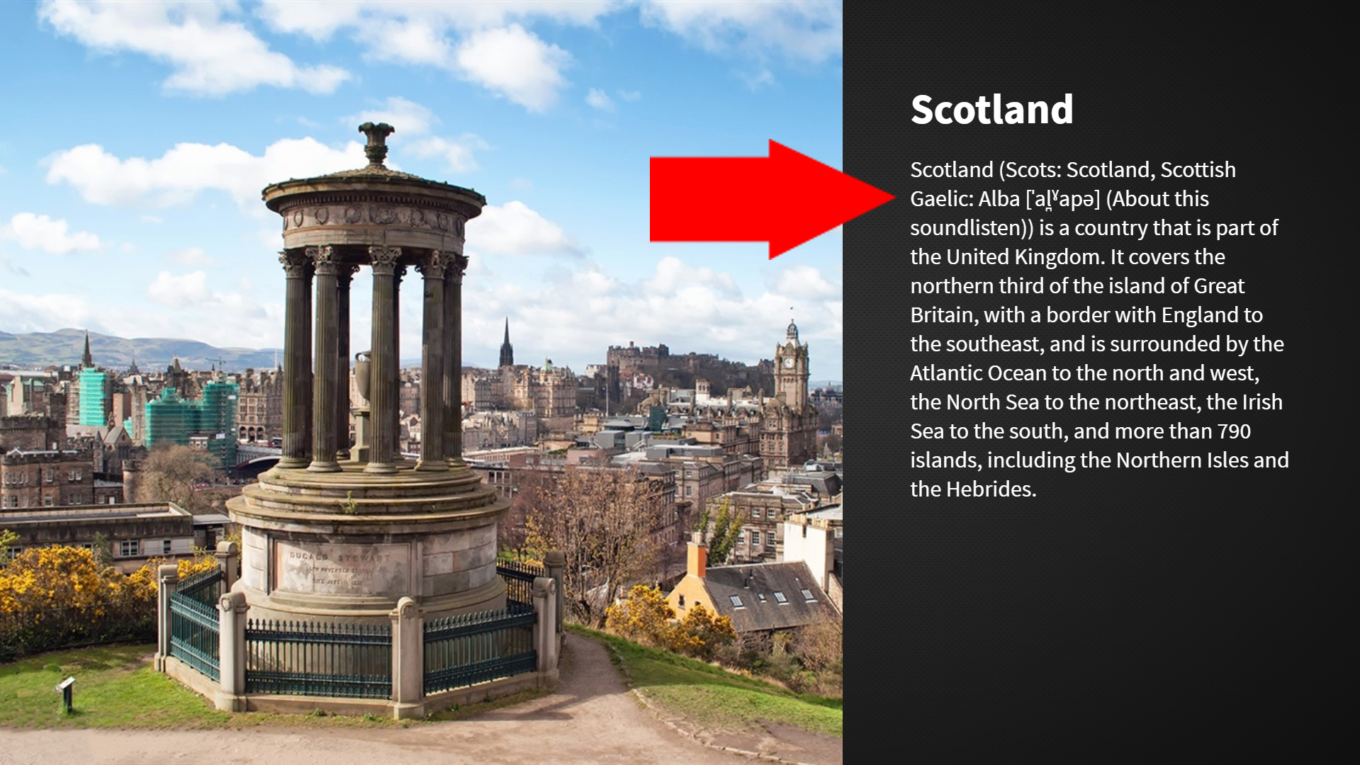
The main text of the article
This textbox contains the main content of the article, which are displayed for most of the presentation viewing types.
Enter the text for the main language, and in the textbox underneath you are able to enter the translated text.
Below the Main content in +activ article and +display article.
-
2.1.1
-
2.2
Settings
Awaiting Translation
-
2.2.1
Question
Picking a poll will make the article extend the article with a poll.
The poll will be attached to the standard article, where users can vote and have the final statistics shown.
The poll can be edited under the Poll section from the main navigation to the left.
-
2.2.2
Author
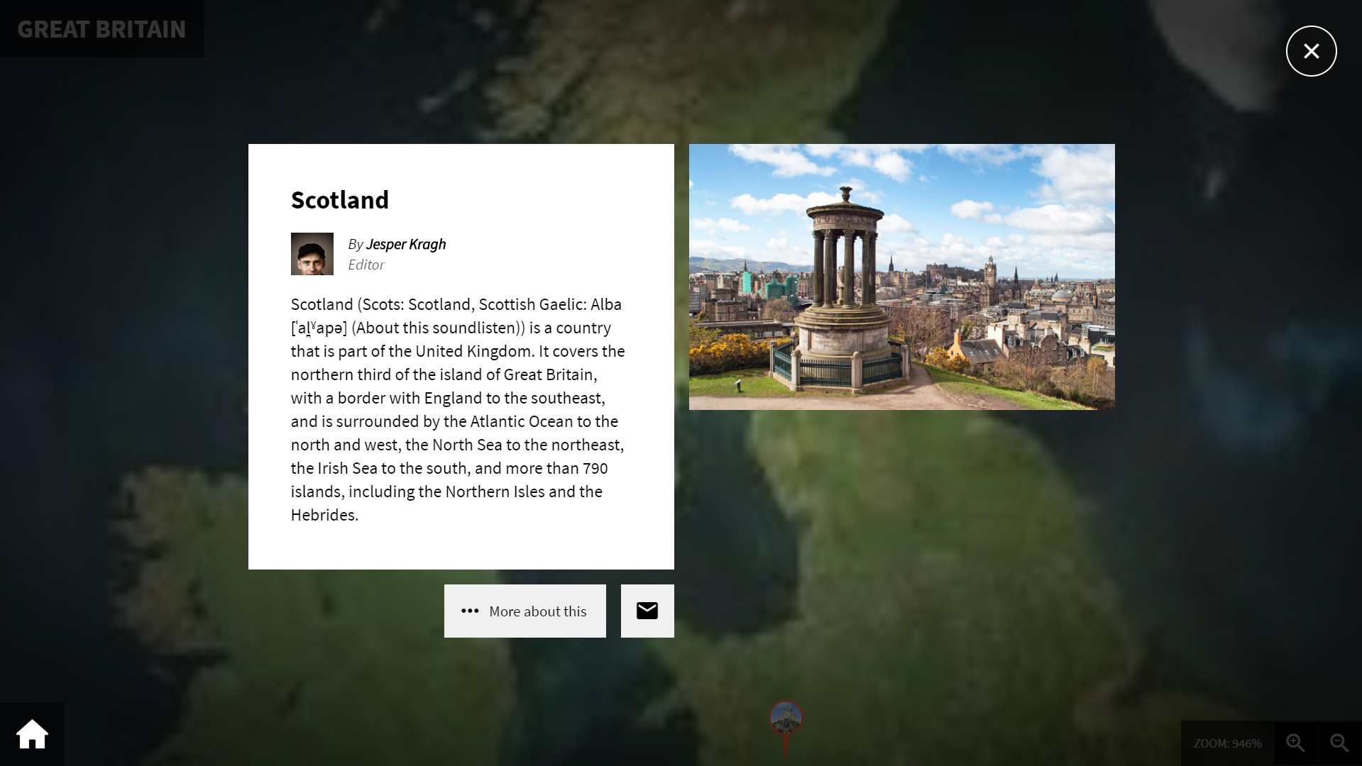
Choose an author from the list of users with author information attached. Author infomation can be edited under the Users section
When choosing an author for an article, information about the person (image, name and title) is displayed above the main text of the +activ-article layout. (not visible on +displays)
-
2.2.3
Variant
Choose the variant of the article display.
For custom applications only.
-
2.2.4
Special view duration
It is possible to set a specific view duration for this article, to override the standard view duration.
The view duration are the time length the article is shown on a +display / +idle-screen.
-
2.2.1
-
2.3
Scheduling
Awaiting Translation
-
2.3.1
Time limit
Enable the Time limit to publish the article at a certain Start time, and have it unpublish after the entered End time.
If enabled it is possible to enter a Start time and End time for displaying this specific article.
Can be combined with repetitions, see below.
-
2.3.2
Repetitions
With repetitions, it is possible to display the article for a specified period of time on selected days of the week.
E.g: From 16:00 to 19:30 on Mondays and Thursdays.Repetitions can be combined with a time limit, so that the article is displayed, for example
every Saturday and Sunday during the summer holidays.Time limits and repetitions are possible on all content levels - collections, presentations/widgets and articles.
-
2.3.1
-
2.4
Links
Awaiting Translation
-
2.5
Timeline
Awaiting Translation
-
2.5.1
Start year
The entered year will be the articles starting position, when displayed on a timeline.
-
2.5.2
End year
When the End year is entered, the article(event) will have a span marker displaying the time from the entered Start year to the End year.
-
2.5.3
ABCLine Index Letter
Select the letter under which the article should be indexed when it appears on an ABC line.
If left blank, the first letter of the title is used. -
2.5.4
Icon
The icon is showed on timelines with the display mode set to Iconbuttons.
-
2.5.1
-
2.6
Digital bookshelf
Awaiting Translation
-
2.6.1
Enable for Digital bookshelf
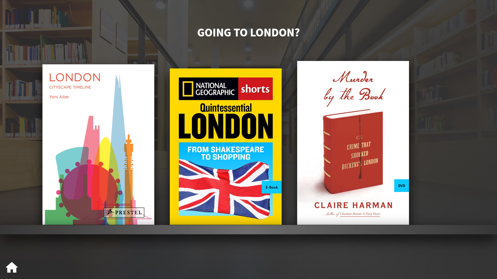
If enabled, the article is available to be used on a Digital bookshelf and it's possible to enter further material specific details.
-
2.6.1
-
2.7
Event
Awaiting Translation
-
2.7.1
Enable for Calendar
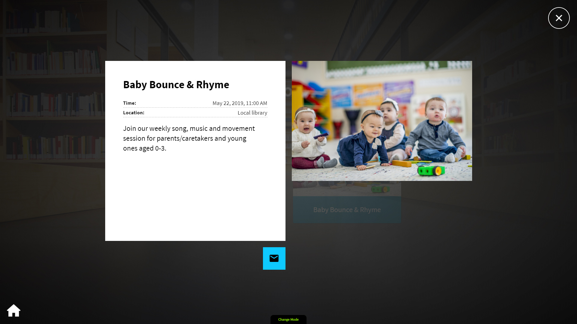
If enabled, the article is available to be used on a Calendar and it's possible to enter further details.
-
2.7.1
-
2.8
Media
Awaiting Translation
-
2.8.1
Attach a sound to image
You can play a sound while an image is displayed. To link a sound to the image, select one of the article's sounds in the dropdown list.
If the list is empty, it means that you have not yet uploaded any sounds to the article. Go to the article's media list and upload an audio file (mp3).
On +activs, a small speaker icon appears in the image in the article. The sound is played when the image is clicked and it opens in large format. Here can set the sound to play automatically by checking the autoplay checkbox.
On +displays, the sound will play automatically in the background when the image is displayed. The display time of the image is extended to suit the length of the sound.
NOTE: Sounds that are linked to images will have a link icon on the media list. These sounds will no longer be displayed as independent sounds and therefore they cannot be arranged in order.
-
2.8.2
Image cropping on fullscreen displays
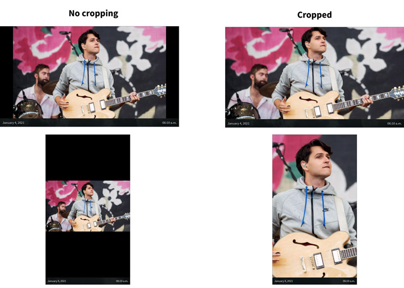
When checked the image will cover the screen, by allowing sides to be cropped if the image proportion are different from the screen proportions.
This setting is only applied to fullscreen images on +displays and +idles, which means articles with no text. Articles with text will instead apply panning animations to its images.
-
2.8.3
Video cropping on +display and +idles
When checkbox is checked the video will be cropped.

IMPORTANT: This only applies to articles when used on uniFi+display.
If you want square-cropped media in the uniFi+activ-article viewer - go to the design setting for the current screen. More here: Show article media as squares.
-
2.8.4
Image Crop Center
With crop center you can select which part of the image is retained in case of automatic cropping.
You usually want to place the marker on peoples faces or any text or graphic that is important for the message.
-
2.8.1
-
2.1
-
3.
Presentations & Widgets
-
3.1
Content
Awaiting Translation
-
3.1.1
Presentation Image
The image of presentations and collections is shown only on +activs main menu buttons.
- Supported image formats are JPEG (.jpg) and PNG (.png) files.
- All sizes and formats are possible as the image is scaled down and set to cover the image area of the button.
Set center point
For presentation and widget images it is possible to set the focus point by placing the pink cross hair. Anywhere the image is cropped the player will try to preserve the selected area of the image.
Tip: reload the page if image is just uploaded and cross hair not visible. -
3.1.2
Description (teaser)
The Description of Presentations, Widgets and Collections is shown only on +activ's main menu buttons.
Consider it a short teaser of what the patron can expect when tapping the button.
It's recommended to keep the character amount below 100*.
If the description field is left blank, it will be replaced by the an automated description will occur e.g. "Explore timeline".
* If the title and description combined are too long to show in the small menu buttons, the description will be replaced by the short automatic description.
-
3.1.1
-
3.2
Display
Awaiting Translation
-
3.2.1
Display variant (+activ)
Choose the way you like your presentation displayed on your active screen.
Consider which direction you want the content to scroll if there is more than the screen can show, or choose a completely alternative design.
-
3.2.2
Calendar display variants (+display/+idle)
Choose the way you like your calendar displayed.
Calendars has three display types:
- Single:
One event per page. Presenting the full article content. Looping through all events by multiple pages - Four Tiles:
Four events per page. Looping through all events by multiple pages - Flexible view:
Up to 20 events per page. One page only. If calendar contains more than 20 events, the rest are not displayed
TIP: Under the Calendar Configuration tab, you can set the Quantity limit or Time limit to get less than 20 events which creates more space for each individual event.
- Single:
-
3.2.3
Bookshelf display variants (+display/+idle)
Choose the way you like your bookshelf displayed.
Bookshelfs have two display types:
- Single article with texts:
One material items per page. Presented as a standard article with material data added.
Looping through all bookshelf materials one by one. - Cover only (texts omitted):
One material items per page. Showing only the cover image.
Looping through all bookshelf materials one by one.
- Single article with texts:
-
3.2.4
Show presentation title (when displaying as single article)
When displaying the presentation as single articles (one by one), you have the option to add the presentation title to the article view.
This makes a great perspective and let the patron know what context the article is part of.
E.g. if the presentation is a calendar, the calendar title wil be added to the article view.
You can choose between two different layouts of the presentation title.
- As a seperate block
Vertical in the left side of horizontal screens.
Top centeret in vertical screens - As a small header above the article title
(*new - added in version 1.11)
- As a seperate block
-
3.2.1
-
3.3
Timeline
Awaiting Translation
-
3.3.1
Timeline objects
Choose the design of your timeline's article buttons, and whether you want to display timeline texts behind them.
There are currently two button designs:
- Round image buttons uses the first article image and crops it into a circle. Around it is a border in your chosen "Light button color".
- Icon buttons primarily look for the article's icon. If no icon attached it falls back to the first image of the article's media section. The Icon button do not crop it's image and it allows using .pngs for transparency.
Either choice can be combined with Timeline Texts
The Timeline texts are placed in a layer below the article buttons. They scroll along the timeline, but at a slower speed to create a paralax effect. -
3.3.2
Timeline span
Select Automatic after articles if you want the timelines start- and end year to precisely reflect the articles you attach under content.
Select Choose years to set start- and end year manually. Note: Attached articles that are out of the chosen year-scope are not included on the Timeline.
-
3.3.3
Timeline resolution
The Resolution is reflected in how many years each article-button represents.
- As default the resolution is 1, which means each button represents one year on the timeline.
- Choose 10 and each button represents a decade. E.g. one button contains the articles of both 1923 and 1928 and the button will be labbeled "1920's"
- Choose 100 and each button represents a century and buttons will be labbeled e.g. "1800's" and 2000's
- Choose 1000 and each button represents a millenium.
Choosing a larger number is a good idea when your timeline spans over a certain amount of years and you'd like to compress it's scrollling length
-
3.3.4
Timeline texts
Timeline texts is a list of texts to support or add perspective to the timeline presentation. Each text are attached to a year and will be displayed as flat text (not interactive) on the timeline.
Note: Only one timeline text will be visible per year. If you add more than one text per year, the player will pick a random when timeline loads.
-
3.3.1
-
3.4
Map
Awaiting Translation
-
3.4.1
Map image file
Allowed filetypes are .png and .jpg
It is recommended to use as high a resolution as possible up to 16 megapixels (4096 x 4096), so the map always appears sharp and clear when zooming.
-
3.4.1
-
3.5
Settings
Awaiting Translation
-
3.5.1
Tags
Add tags to make your searches easier.
-
3.5.2
Allow users to reserve material already home
This feature is aimed for situations where library users cannot find (or reach) any searched material marked as 'home'. Allowing the user to reserve it will let them have it in reach the next time they visit the library.
-
3.5.1
-
3.6
Scheduling
Awaiting Translation
-
3.6.1
Time limit
Enable the Time limit to publish the presentation/widget at a certain Start time, and have it unpublished after the entered End time.
If enabled it is possible to enter the Start time and End time for displaying this specific presentation/widget.
Can be combined with repetitions, see below.
-
3.6.2
Repetitions
With repetitions, it is possible to display the presentation/widget for a specified period of time on selected days of the week.
E.g: From 16:00 to 19:30 on Mondays and Thursdays.Repetitions can be combined with a time limit, so that the presentation is displayed, for example every Saturday and Sunday during the summer holidays.
Time limits and repetitions are possible on all content levels - articles, presentation/widgets and collections.
-
3.6.1
-
3.7
Design
Awaiting Translation
-
3.7.1
Background Image (presentation specific)
This image overrides the default background (set by screen settings) for this specific presentation only.
If left empty, the presentation or widget will use the background settings from it's attached screen.
Your background images is by default scaled to "fill out" the background.
We recommend a resolution of 1920 x 1080 pixel for applications in horizontal view.If you choose to [Tile] the image the image will not be scaled, but duplicated in as many rows an columns as needed to fill the background. No minimum size is required.
-
3.7.2
Text background color (for display presentations)
The text background color is an overlay placed upon the background or article images to make texts hereon more readable.
This is recommended if you use a sparse (primary) background, but on +display and +idles the text lies directly on the background and can therefore be difficult to read.
You can set the transparency of the color overlay by the transparency slider below.
-
3.7.3
Text background transparrency
The text background is a color that overlays the background to make texts on this more readable.
Here yor set how transparent the overlay should be. 0 is completely transparent and 1 is completely opaque.
-
3.7.4
Text color - when placed on background
Here you can choose a font color for texts that are placed directly in the background. This mainly applies to +display / +idle texts, but also presentation titles on +activ.
-
3.7.1
-
3.8
Calendar
Awaiting Translation
-
3.8.1
Limit time duration
Choose the amount of days the calendar show look forward.
Show "today events" on one +display / +idle page:
- insert here 1 day as time duration.
- Under the tap "Display", choose the flexible (up to 20 events) calendar display for non-interactive screens.
-
3.8.2
Limit quantity
Set how many events from the given supplier you want to show (as a maximum).
Note: If you're using a "Flexible" calendar display it will limit the amount to 20 events by default.
Limit this further for more space for the individual events. Recommended between 5 and 16 events.Tip: Another way to limit the amount is by using the Time limit (above). This will result in a varying amount of events depending on the density of events in the given future days.
-
3.8.3
Limit Location
If you like your calendar to only show events from one specific location you can do so by selecting one from the list. The list is generated from all the different locations in the event feed.
You can furthermore add you own location filter by selecting 'Selfdefined' and enter your own location specific keyword.
-
3.8.1
-
3.9
Question
Awaiting Translation
-
3.9.1
Question
Enter your question here.
The question will be shown as the title of the question on the +activ screen.
-
3.9.2
Translation of the question
Here it is possible to translate the question into the languages you support.
Pick the langauge in the dropdown, enter the translated question and press save.
Afterwards you are able to add another language by repeating the process.
-
3.9.3
Drag and drop to change order of questions
The questions created for the quiz is shown in this list.
- Clicking on the question title or the edit button goes to the edit page of the specific question.
- By clicking delete you delete a question in the quiz.
- Changing the order of the questions shown in the quiz on +activ is possible by dragging and dropping the list items to the desired position. The top question in the list is the first question shown in the +activ and so forth. Remember to save after the order of the questions has been changed.

-
3.9.1
-
3.10
Bookshelf
Awaiting Translation
-
3.10.1
Collection Items
When communicating with the Search API from DBC, this setting is sent as an attribute and determines whether other materials in a collection should be included in the results. This will be true as a default.
-
3.10.1
-
3.11
Web Frame
Awaiting Translation
-
3.11.1
Web Frame
 Enter a valid URL and press the Preview button to preview the website inside a Web Frame.
 As the Web Frame feature is in Beta, we currently don't do any validation of the format of the applied address/URL. Please do note, that a lot of sites, prohibit themselves from being embedded inside a frame like this. Ideally, site that are being embedded should be designed for the purpose. An example of this could be google maps which have a specific "embed" version like this
"https://www.google.com/maps/embed"
Another great use case would be the case where you or direct partner is in full control of the site you wish to embed, so that you have the possibility to upgrade or optimize the content and communication for this purpose.
If the site isn't working in the browser, it might still be possible that it works when it is shown on your physical controllers, as the application- and web version are using different technologies for the purpose.
Known limitation:
- Cookie communication and acceptance might not be possible
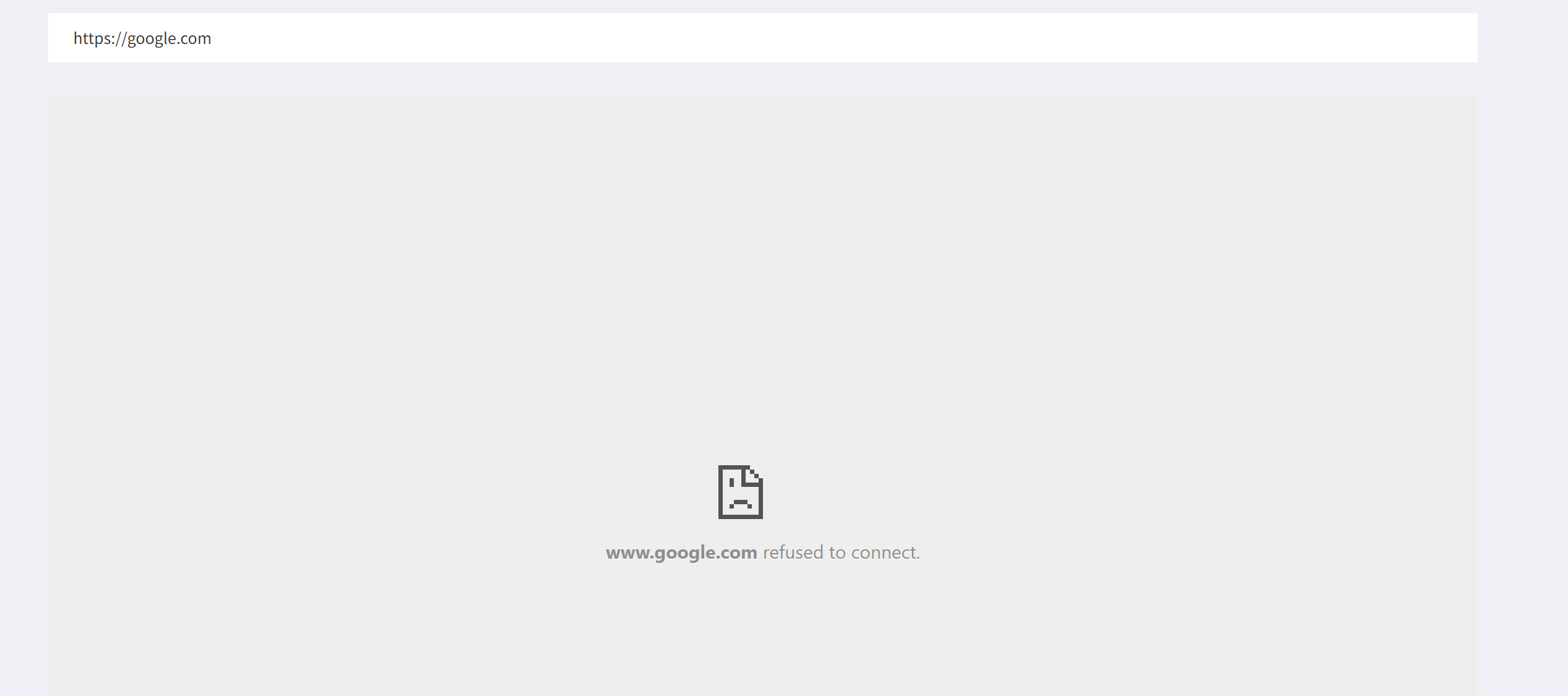
- Sites straight up fails for security reasons, making the preview completely empty
- Sites informs that they cannot be embedded. Example:
-
3.11.1
-
3.1
-
4.
Collections
-
4.1
Collection Image
The collection image is shown only on uniFi+activs main menu buttons.
- Supported image formats are JPEG (.jpg) and PNG (.png) files.
- All sizes and formats are possible as the image is scaled down and set to cover the image area of the button.
-
4.2
Description
The collection's Description text is shown only on uniFi+activs main menu, when the collection is presented in a large menu button.
The text box will adapt to the height of the text and can therefore contain longer descriptions.
It's recommended though to keep the character amount below 150.If the description field is left blank, it will be replaced by the short description (if submitted).
In last case an automated description will occur ex. "Explore timeline".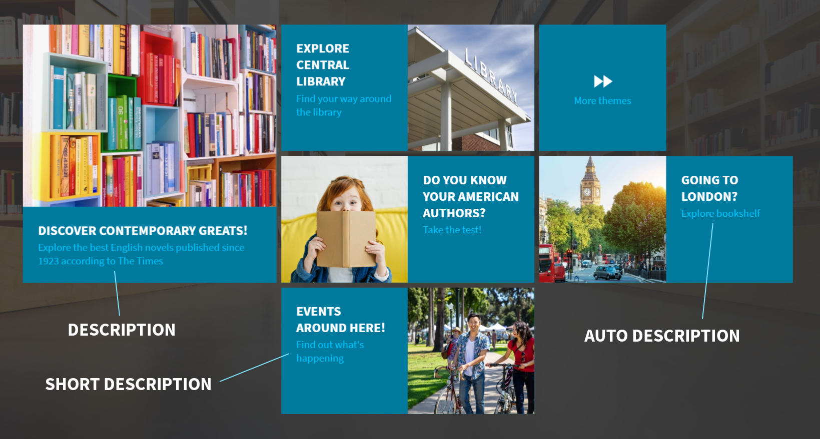
-
4.3
Short Description
The collection's Short description text is shown only on uniFi+activs main menu, when this is presented in a small menu button.
Small button's text box will be cut if the description is too long, therefore It's recommended to keep the character amount below 60 (depending on the length of the title).
If field is left blank an automated description will occur ex. "Explore timeline".

-
4.4
Scheduling
Awaiting Translation
-
4.4.1
Time limit
Enable the Time limit to publish the collection at a certain Start time, and have it unpublished after the entered End time.
If enabled it is possible to enter the Start time and End time for displaying this specific collection.
Can be combined with repetitions, see below.
-
4.4.2
Repetitions
With repetitions, it is possible to display the collection for a specified period of time on selected days of the week.
E.g: From 16:00 to 19:30 on Mondays and Thursdays.Repetitions can be combined with a time limit, so that the collection is displayed, for example every Saturday and Sunday during the summer holidays.
Time limits and repetitions are possible on all content levels - articles, presentations/widgets, collections.
-
4.4.1
-
4.1
-
5.
General
-
5.1
Translation of the title
Here it is possible to translate the title into the languages you support.
Pick the langauge in the dropdown, enter the translated title and press save.
Afterwards you are able to add another language by repeating the process.
-
5.2
Translation of the main text
Here it is possible to translate the main content into the languages you support.
Pick the langauge in the dropdown, enter the translated content and press save.
Afterwards you are able to add another language by repeating the process.
-
5.3
Media files
Maximum files per upload is limited to 25, with one article having a limit of 100 media files.
Video
- Supported video formats are .mp4 (H.264) and .webm
- Does not support these video formats: .wmv, .mpg or .avi, flv or f4v
- Recommended video resolutions: FullHD 1080 (1920x1080), HD 720 (1280x720p).
(All formats are possible though) - Try using video-files compressed to a smaller file size to improve performance. Make sure you do not compress videos too much however, as this can greatly reduce the quality of the video files.
Images
- Supported image formats are JPEG (.jpg), PNG (.png) and SVG (.svg) files.
- All image dimensions are possible, but for uniFi+activ it is recommended that narrow images have a maximum of a 16:9 format (or 9:16 upright) - to fit in the various image frames.
- On uniFi+display and +idle different actions are taken on images out of format. Collection article images pan. Book covers zoom. Fullscreen images resize to fit. To make your +display images match perfectly, see content area sizes of +display and +idles. Or you can allow image cropping und the Advanced tab
- “Map” images can have any aspect ratio (within reason). They just become scrollable.
- “Map” images can be up to 16 Mega pixels in size (4096x4096 pixels if image is square), but an image width of between 2500 and 3500 pixels will improve performance.
- Re-size formats (expect all photos to be resized into these formats): Original, HD-compatible and thumbnail.
Audio
- Supported audio format is: MP3 (.mp3)
-
5.1
-
6.
Poll
-
6.1
Poll
Enter your poll name here.
The poll name will be shown as the title of the poll on the +activ screen.
Polls can be used on the +activ screen to engage users in the library.
The poll can be attached to an article in the article Settings tab. -
6.2
Translation of the poll
Here it is possible to translate the poll into the languages you support.
Pick the langauge in the dropdown, enter the translated question and press save.
Afterwards you are able to add another language by repeating the process.
-
6.1
